It's been two months since my first radiosonde recovery. In this post, I perform some analysis of the receiving stations at my apartment in San Francisco and my vacation home/parents place in Los Gatos. I also include the python code needed to generate your own plots.
San Francisco Station
Immediately after I got home from my first recovery, I converted my regular amateur radio station at my apartment to receive radiosondes. The external antenna is a Diamond X-50NA, which is a great amateur radio 5/8 wave 2m/70cm dual-band antenna. Coax up to the roof is about 80 ft of LMR-400, which is calculated at around 1.5 dB loss at 145 MHz and 2.5 dB at 450 MHz, plus connectors. Because this had a base station radio attached, it didn't have an LNA or filter up at the antenna.
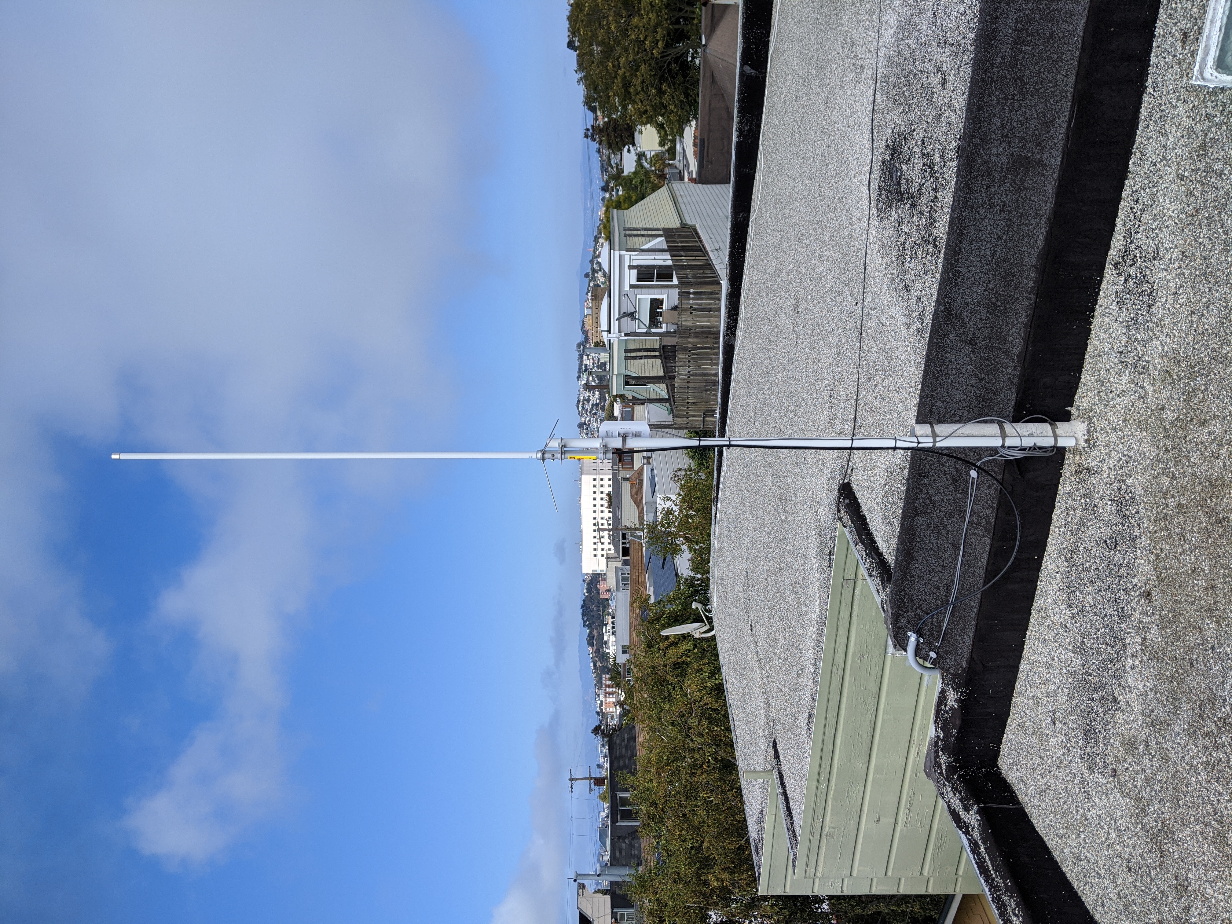
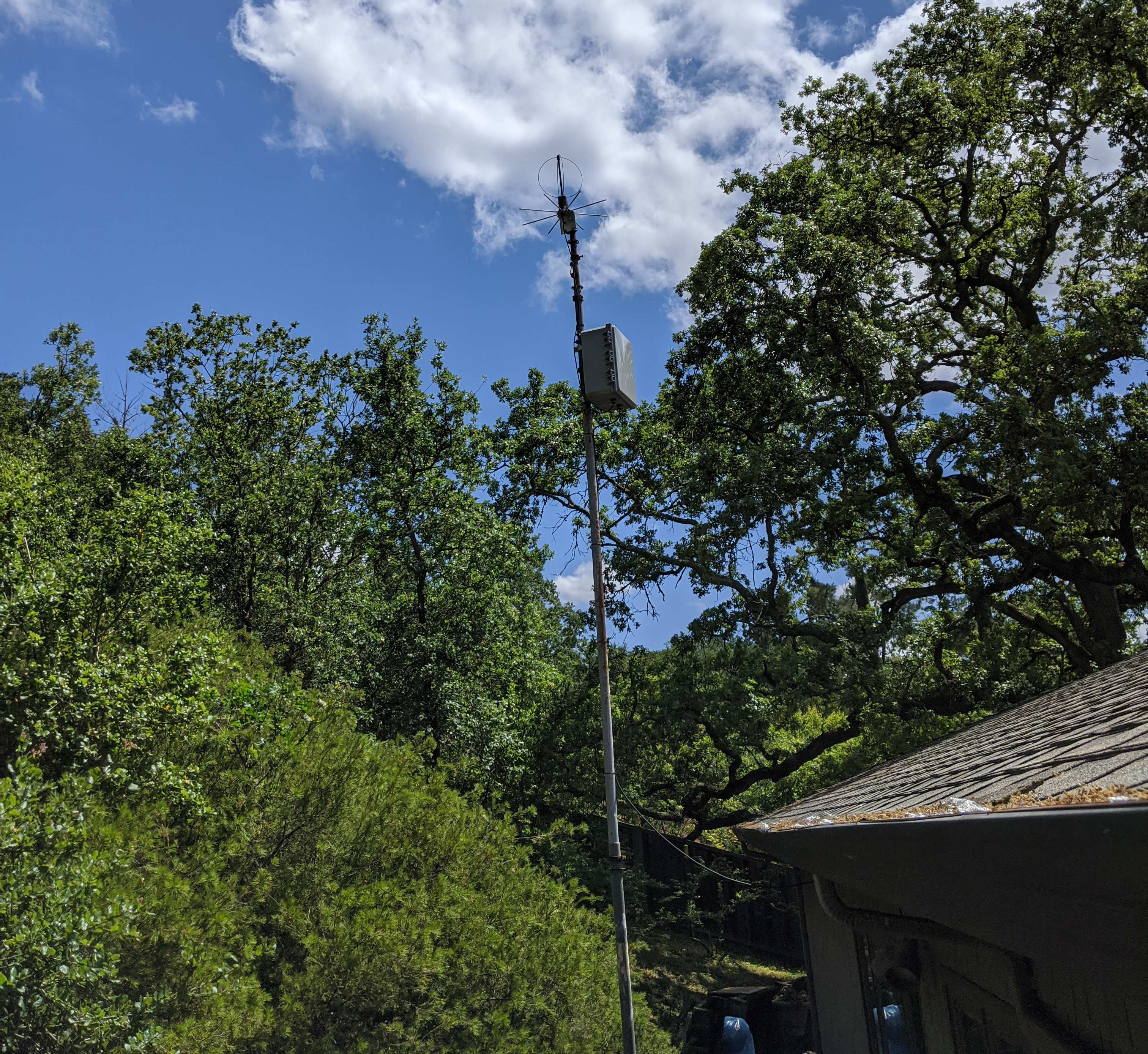
Here is a pic of the antenna, mounted to a 5 ft pole that is clamped to a steel sewage roof vent. This is a very easy (temporary) installation. The Nanostation M5 also installed is part of the San Francisco Wireless Emergency Mesh.
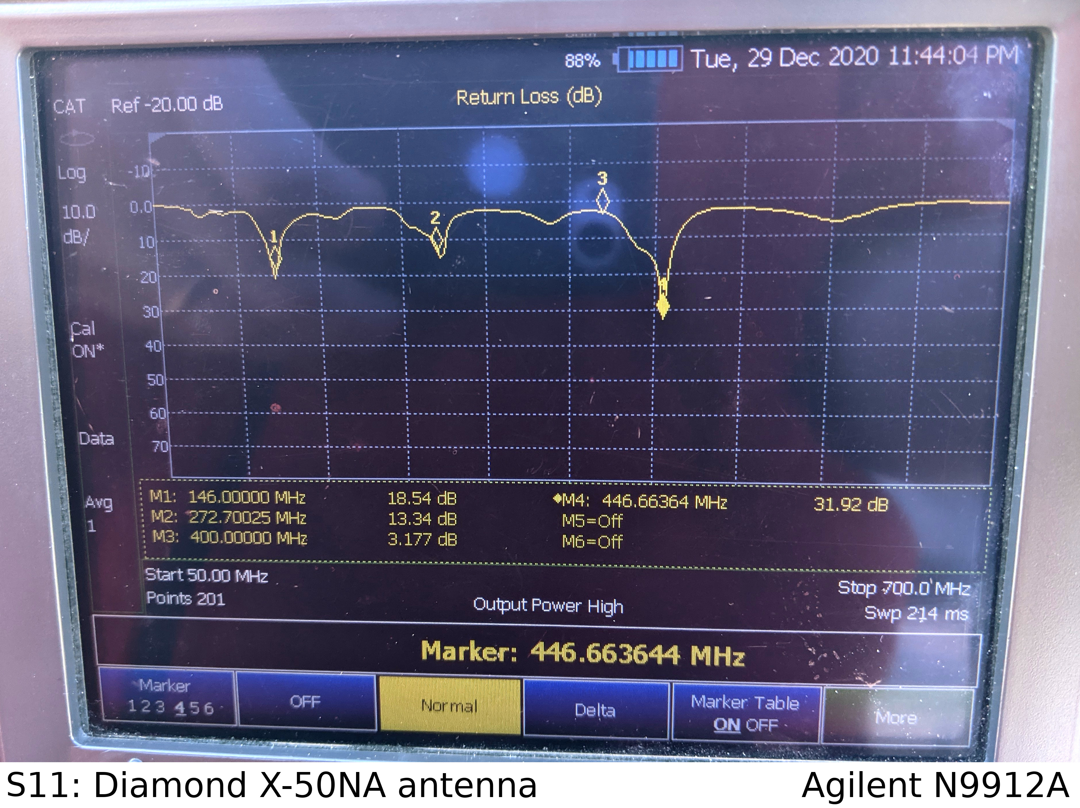
This antenna is very rugged, and works really well on the amateur radio frequencies. I did some S11 return loss measurements from 50 to 700 MHz, and the return loss is almost 20 dB for 146 MHz and 30 dB for 446 MHz. However, this antenna doesn't work so well down at 400 MHz, where the radiosondes transmit. As you can see, Marker 3 shows the measured S11 return loss of this antenna at 400 MHz is 3.2 dB, which converted to SWR is 5.4:1. Pretty bad!
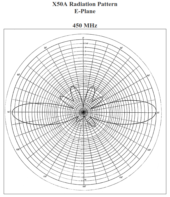
In addition to the rather poor performance at 400 MHz, this antenna also has another thing going against it: the radiation pattern. For a typical amateur station, it doesn't make sense to send RF energy up into space, since there's nobody up there to receive you. You want all of your energy at ground level. 5/8 wave antennas concentrate most of their energy towards the ground, and manufacturers even stack 5/8 wave elements for higher gain, such as with this antenna. The higher the gain, the more energy is pushed towards the horizon. Not great for balloons up in the atmosphere.
This plot is taken from the Diamond webpage, showing that the 3 dB beamwidth is about 30 degrees around horizontal. The plot is a bit hard to read, but imagine the antenna is at the center, and the horizontal line (90 degrees) is the ground. The circular scale (concentric rings) is log dB from 0 dB out at the edge to 30 dB in the center.
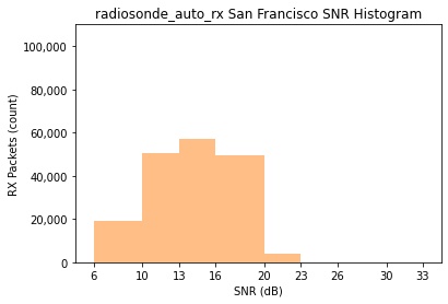
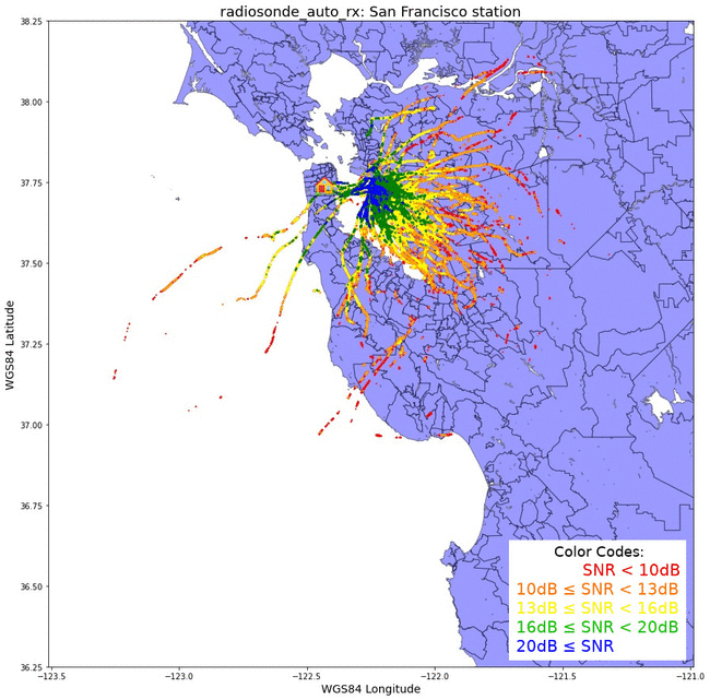
Even with this antenna mismatch, suboptimal radiation pattern, and no LNA, this station did receive 180,362 packets from 111 radiosonde flights. This map shows signal-to-noise (SNR) values plotted on a map of the Bay Area. Red is weakest signals, and blue is strongest.

This is a really interesting plot. It clearly shows that the strongest packets (in blue) were received just after the radiosonde lifted off from Oakland Airport. Ignoring the fresnel zone for now, UHF frequencies operate on line-of-sight: If you can physically see the transmitter, you should be able to receive data from it.
Since there is nothing blocking the transmission paths (such as trees or buildings) as the balloon rises in elevation, we can conclude that the radiation pattern of the antenna is the thing that is causing the SNR to drop rapidly as the balloon rises further away from the launch site. The balloon floats up and out of the main antenna lobe (which is close to the horizon), losing 10 dB of signal strength as it gains altitude. Then path loss dominates.
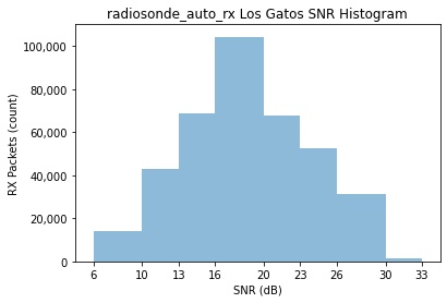
Another way to look at the SNR data is a histogram of the data. SNR values are binned into 3 dB increments from 6 dB up to 33 dB, with the Y axis showing number of packets per bin. The bins are the same as the multicolored plot above. There were so few packets received less than 6 dB SNR that they don't even show on the histogram plot.
Los Gatos Station
Down in the South Bay, I installed a SatNOGs station back in summer 2018. While it was receiving satellites and contributing data to the network, its utility was limited because the antenna just wasn't big enough to receive weak university CubeSats. I decided to convert this station to receive radiosondes.
The conversion was very easy, and done completely remote. I stopped the SatNOGs software using sudo systemctl stop satnogs-client, disabled the client from starting after a reboot with sudo systemctl disable satnogs-client, installed docker, and ran the Docker install procedures from the wiki. Since this station has a LNA powered by the RTL SDR internal bias tee, I enabled bias = True in the station.cfg configuration file.
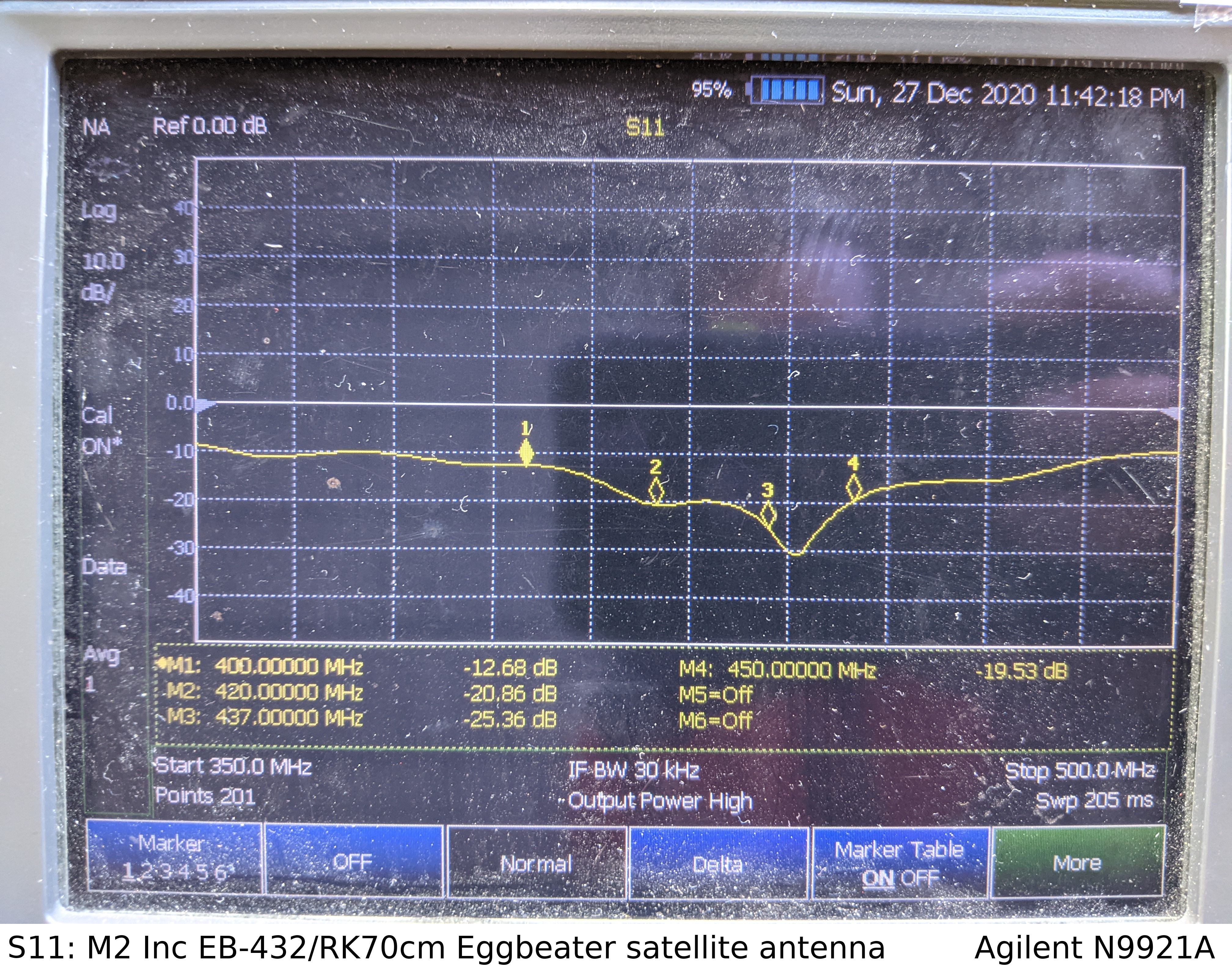
The M2 EB-432/RK70cm eggbeater antenna I selected for SatNOGs has a really wide bandwidth, specified from 400 to 470 MHz. Here's a S11 Return Loss measurement of this antenna, from 350 to 500 MHz. Measured return loss at 400 MHz (Marker 1) is around 12.6 dB, which is 1.6:1 SWR. Anything better than 10 dB return loss is good to me! The 70 cm amateur radio band is delineated with Markers 2 and 4, showing better than 20 dB return loss across those frequencies.
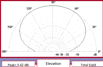
With regards to the radiation pattern, remember that this antenna is designed for LEO satellites. Gain is higher straight overhead versus down towards the horizon. Polarization at the horizon is horizontal, transitioning to right-hand circular as elevation increases. While the radiosondes use vertical polarization, it's only a 3 dB reduction going between linear and circular polarization. Not ideal, but not horrible.
This plot from the EB-432 datasheet shows the 3 dB beamwidth of the antenna is about 140 degrees, centered straight up. Overall gain is 5.6 dB, which is normal for a hemispherical antenna like this.
The only other frequency-dependent device in the receive chain is the LNA, which is broadband enough to operate down at 400 MHz.
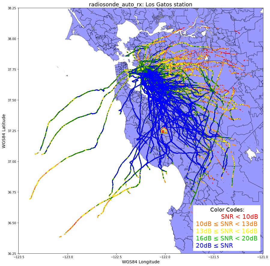
This station received 382,169 packets from 119 radiosonde flights from October 28th to December 28th 2020. Here is a map of all the flights, with received SNR in different colors.
Here is the histogram of SNR for the received packets for this station. More than 100k packets were received with SNR between 16 and 20 dB. That's a pretty strong signal!
Comparison
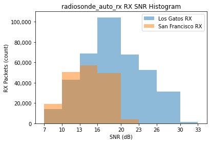
As one can see just in the number of packets received by each station (382k vs 180k), the remote station in Los Gatos performs much better than the San Francisco station. Also interesting is that there were 7 flights that the San Francisco station didn't receive any packets from, maybe due to local noise? Putting the histograms on top of each other, you can see all of these extra packets have a very high SNR.
Plotting signal strengths on a map, it's interesting to see a visual representation of how much better the Los Gatos station performs.
Another interesting thing to look at in this animated gif is the paths of the balloons. The prevailing high altitude winds are south-east at this time of year. The Los Gatos station is 36 miles south of the launch site, so most of the balloons head directly for that station.
In summary, I think the Los Gatos station performs better because:
- Antenna is designed for satellite work, with better radiation pattern and return loss
- LNA installed, dropping system noise temperature down
- Much less local RFI due to fewer houses and noise sources nearby
- Prevailing winds bring balloon flight paths closer
Code
To make the plots above I used python3 and GeoPandas running in a Jupyter Notebook on an Ubuntu 20.04 virtual machine. I mostly used this tutorial for plotting the points on the map.
The final step to generate the map with the SNR values takes a while in jupyter, eating up a lot of memory in the process. There is probably a more elegant way to split up the SNR values instead of trimming the dataframe twice.
Jupyter notebook, using Jupyter 6.1.5 and Python 3.8.5
Supplementary files, including the shapefiles and some balloon telemetry
Code, with the jupyter notebook comments:
#!/usr/bin/env python
# coding: utf-8

# In[1]:


import pandas as pd
import matplotlib.pyplot as plt
import descartes
import geopandas as gpd
import glob, os
import matplotlib as mpl
from shapely.geometry import Point, Polygon


# In[2]:


# Create the basemap of the area. The original shapefile are census areas in the bay area.
# Also need .shx and .prj files in the same folder
census_map = gpd.read_file('TG00CAZCTA.shp')

# The census map's shapefile is using UTM coordinates for all the points. This changes the
# Coordinate Reference System to WGS84 lat/lon, which is what the radiosonde telemetry is in
census_map = census_map.to_crs('EPSG:4326')

# Create a plot, set some lat/long limits, and plot it
fig,ax = plt.subplots(figsize = (15,15))
ax.set_ylim([37, 38.25])
ax.set_xlim([-122.75, -121.5])
census_map.plot(ax = ax, linewidth=1, edgecolor='black')


# In[3]:


# Create a pandas dataframe from all the radiosonde .log files that are in the "log" directory
df = pd.concat(map(pd.read_csv, glob.glob(os.path.join('log/', "*.log"))))

# Print the dataframe so we can see it. Jupyter only plots a few lines (thankfully)
print(df)


# In[4]:


# Here we can look at the minimum value in the "snr" column
minsnr = df["snr"].min()
print('Minimum SNR: %f' % minsnr)


# In[5]:


# Here we can look at the max value in the "alt" column, max altitude packet received
maxalt = df["alt"].max()
print('Max altitude: %d' % maxalt)


# In[6]:


# Create a series (list) from the "snr" field of the pandas dataframe
snrhist = df["snr"]

# Plot the histogram, with the bins below
ax = snrhist.plot.hist(bins=[6,10,13,16,20,23,26,30,33], alpha=0.5, color='tab:blue')

# Add comma thousands separator for the Y-axis
ax.get_yaxis().set_major_formatter(mpl.ticker.FuncFormatter(lambda x, p: format(int(x), ',')))

# Add some nice formatting for the plot
plt.xticks([6,10,13,16,20,23,26,30,33])
plt.xlabel('SNR (dB)')
plt.ylabel('RX Packets (count)')
plt.title('radiosonde_auto_rx SNR Histogram')
plt.ylim(ymin=0, ymax=110000)
plt.xlim(xmin=4.5, xmax=34.5)

# Save the figure locally
plt.savefig('snr.jpg', bbox_inches='tight')


# In[7]:


# Create geometry points from the lat/lon in the pandas dataframe
geometry = [Point(xy) for xy in zip( df["lon"], df["lat"]) ]
geometry[:3]


# In[8]:


# Create a geopandas dataframe, using the pandas dataframe and the geometry points
geo_df = gpd.GeoDataFrame(df,                  #specify dataframe used
                         crs = 'EPSG:4326',    #specify coordinate ref system
                         geometry = geometry)  #use the lat/long point list created

# Show snippet of this new geo dataframe
geo_df.head()


# In[9]:


# OK, let's finally plot this geopandas dataframe!
# First off, create the underlying map
fig,ax = plt.subplots(figsize = (15,15))
ax.set_box_aspect(1)
ax.set_ylim([36.25, 38.25])
ax.set_xlim([-123.5, -121.0])
ax.set_ylabel('WGS84 Latitude', fontsize=14)
ax.set_xlabel('WGS84 Longitude', fontsize=14)
ax.set_title('radiosonde_auto_rx: Station', fontsize=18)
census_map.plot(ax = ax, alpha = 0.4, color="blue", linewidth=1, edgecolor='black')

# This next part slices up the geo dataframe based on SNR value bin.
# The new geo_df1 has all the points with SNR greater than 10 (including SNR > 20). And so on.
geo_df1 = geo_df[geo_df['snr'] >= 10]
geo_df2 = geo_df1[geo_df1['snr'] >= 13]
geo_df3 = geo_df2[geo_df2['snr'] >= 16]
geo_df4 = geo_df3[geo_df3['snr'] >= 20]

# Trim out the values above the bin. Now geo_df only has values below SNR 10.
# geo_df1 has SNR > 10 (from above), now trim out SNR > 13, so you only get 10 to 13
geo_df = geo_df[geo_df['snr'] < 10]
geo_df1 = geo_df1[geo_df1['snr'] < 13]
geo_df2 = geo_df2[geo_df2['snr'] < 16]
geo_df3 = geo_df3[geo_df3['snr'] < 20]

# Plot these points.
geo_df.plot(ax = ax, markersize = 1, color = "red", marker = "o")
geo_df1.plot(ax = ax, markersize = 1, color = "orange", marker = "o")
geo_df2.plot(ax = ax, markersize = 1, color = "yellow", marker = "o")
geo_df3.plot(ax = ax, markersize = 1, color = "green", marker = "o")
geo_df4.plot(ax = ax, markersize = 1, color = "blue", marker = "o")

# Save the figure (if you don't crash jupyter)
# I added the legend copy/paste with gimp
plt.savefig('map.jpg', bbox_inches='tight')


# In[ ]: