In the beginning of March, something happened to the regular cadence of radiosonde launches from Oakland Airport. No balloon was launched on March 11th 2300 UTC, nor the next standard launch window on March 12th 1100 UTC (5am Pacific time). The SDM Ops Status Messages had a 10142 error for Oakland, which is ground equipment failure. I'm guessing that something broke or got jammed on their autolauncher, or maybe they ran out of hydrogen gas.
By the afternoon of March 12th, the issue appeared to be resolved, and there was three launches in quick succession. The first and third balloons, S3231708 and S2321334, were normal, but the middle balloon slowly rose and leveled out around 35,000 meters (~115,000 feet), and became a "floater" radiosonde. Maybe was underfilled with hydrogen gas, or had a hydrogen/air mixture instead of pure hydrogen.
The serial number of this floater balloon was S3240385, and it launched around 20:40 UTC on March 12th.
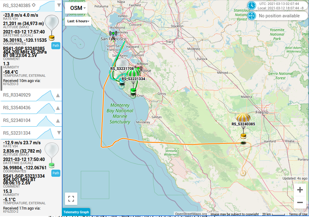
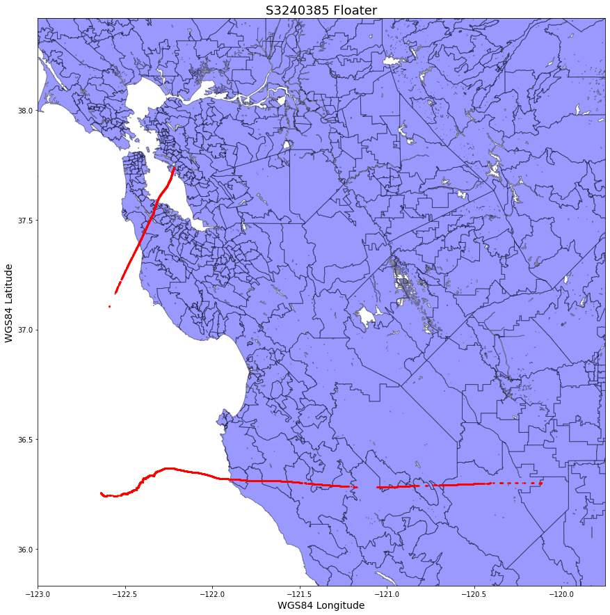
Due to buildings in the way, I stopped receiving the balloon west of Santa Cruz, and started picking it up west of Monterey. The almost vertical line is an artifact of how Sondehub plots telemetry. Using the code below, I plotted the telemetry received from this balloon.
Altitude and Ascent Rate
The intended ascent rate of a radiosonde is 5 meters/second. This means that it takes about 90 minutes for the balloon to reach 30,000 meters (~115,000 feet) in altitude, where the balloon bursts and quickly falls back to earth in about 30 minutes. Two hours after a regular launch, the radiosonde hardware is back on the ground.
Plotting the ascent rate and altitude of this balloon, we can see that the actual ascent rate of this balloon was closer to 3 m/s (red line), and it leveled off at around 35,000 meters (blue line). I added green lines for the intended 5 m/s ascent rate, and neutrally buoyant 0 m/s ascent rate.
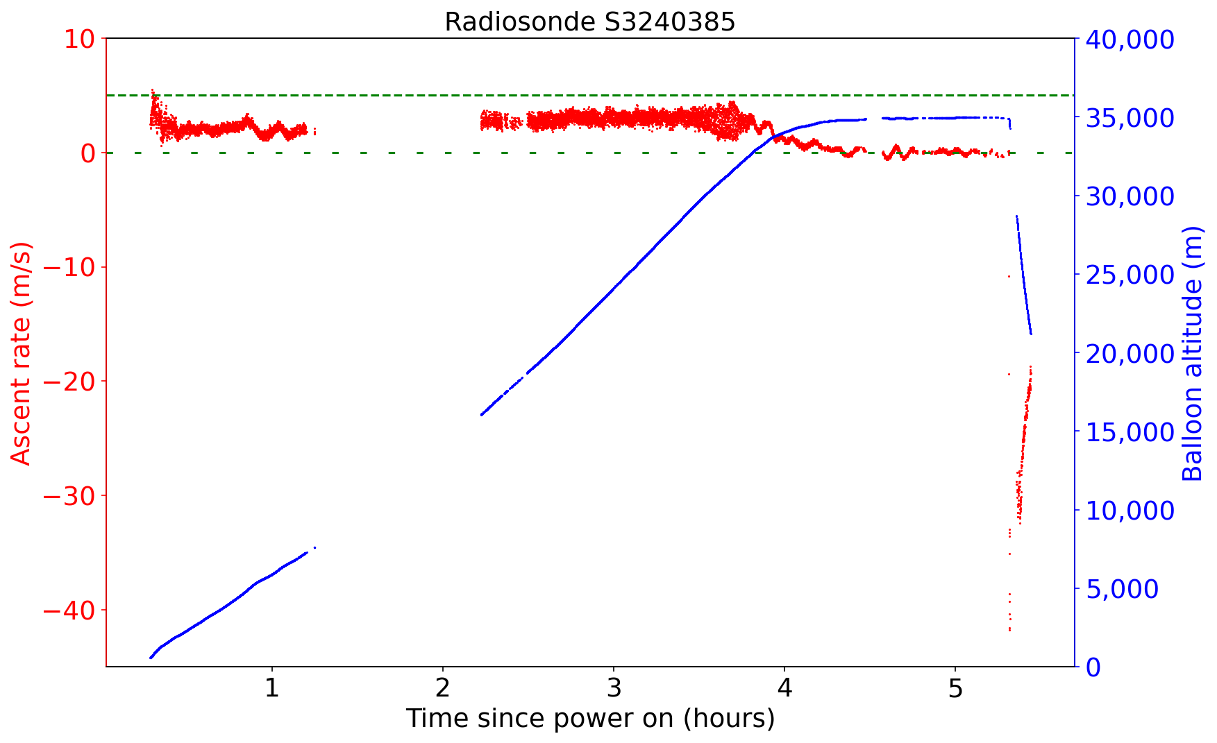
You can also see that when the balloon finally bursts, the radiosonde falls at around 40 meter/sec, which is around 130 feet/sec. Since there is not much air up there, this is just a free fall. Plugging in rough values (radiosonde weight 109 grams, and cross-sectional area of 1 sq ft for the radiosonde and shredded balloon) into the NASA Terminal Velocity calculator gives us a calculated terminal velocity of 143 feet/sec, pretty close! Once the air starts to thicken at lower altitudes, the descent rate slows down.
Zooming in on the last part of this graph, where the balloon starts to free float, is pretty interesting.
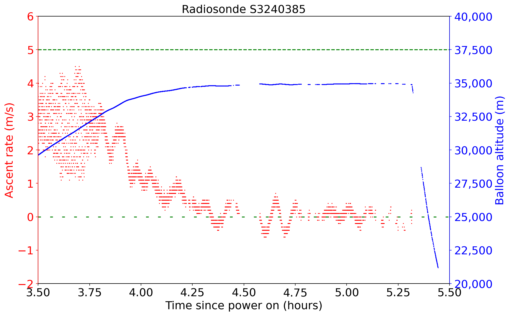
At around 33,000 meters altitude, we see the ascent rate starts slowing down. The latex of the balloon is no longer stretching as it (very slowly) rises. We finally reach neutrally bouyant around 4.25 hours after launch, and the balloon slowly oscillates around this point for the next hour. Altitude is just under 35,000 meters. Then, for an unknown reason, the balloon bursts, and the free fall begins.
Horizontal Velocity
The whole purpose of launching these weather balloons twice daily is to measure the upper atmosphere wind, temperature, and humidity. Looking at the GPS data gives us direction and speed of the balloon in the jetstream, and separate temperature and humidity sensors directly measure those variables.
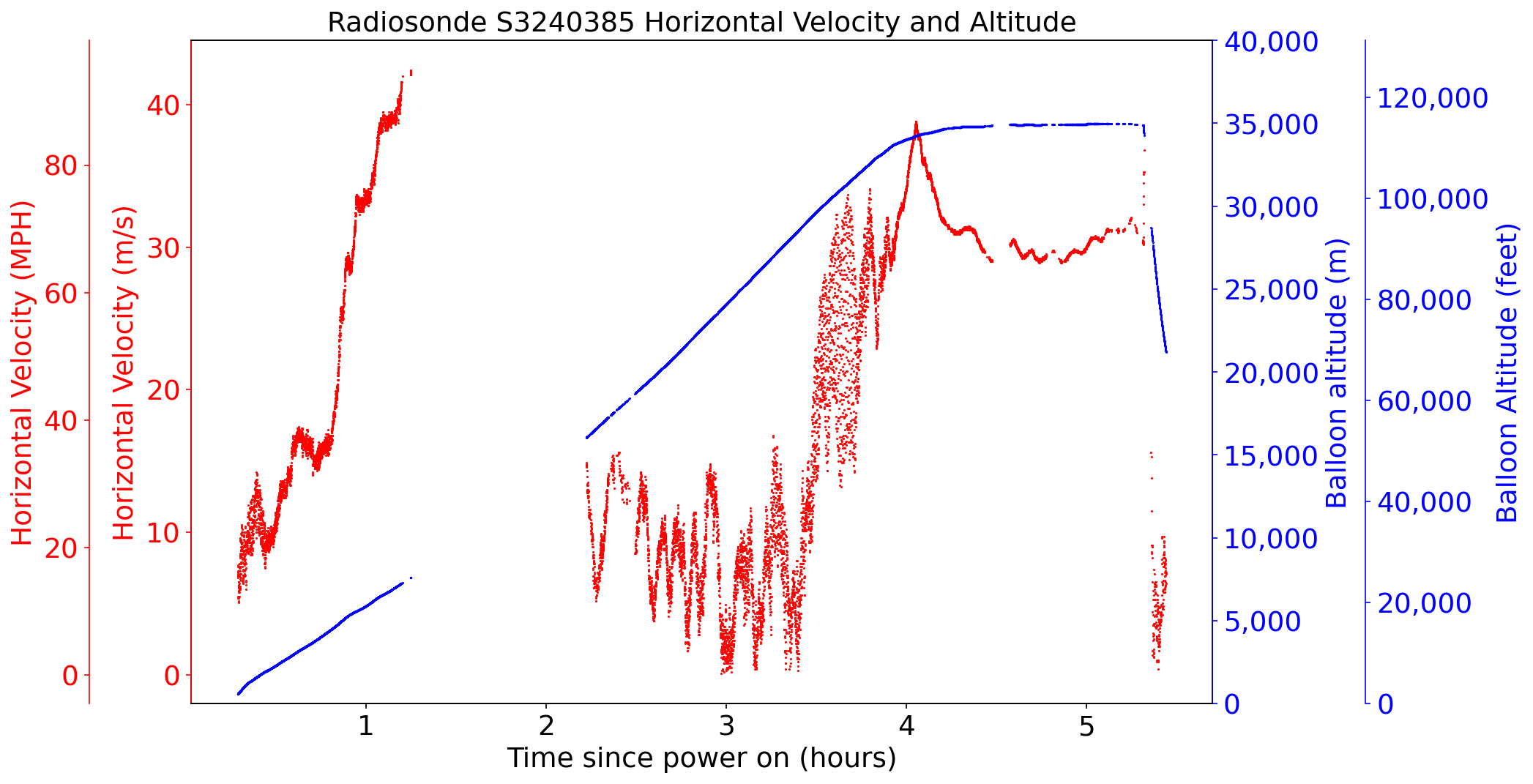
We can see that the winds increase in speed to 90 MPH at 30,000 feet. After the telemetry drop out, the speeds are much lower, but rise again to around 70 MPH as the balloon reaches maximum altitude. When the radiosonde is floating at 35,000 meters, it's flying about 30 meters/second due east in the jetstream.
Temperature and Humidity
Here is a temperature and humidity plot from this balloon. Since I'm not a scientist, the way this data is presented isn't really useful for atmospheric sciences or weather forecasting. A real skew-t plot, with temperature and humidity as a function of altitude/pressure, is more useful for forecasters.
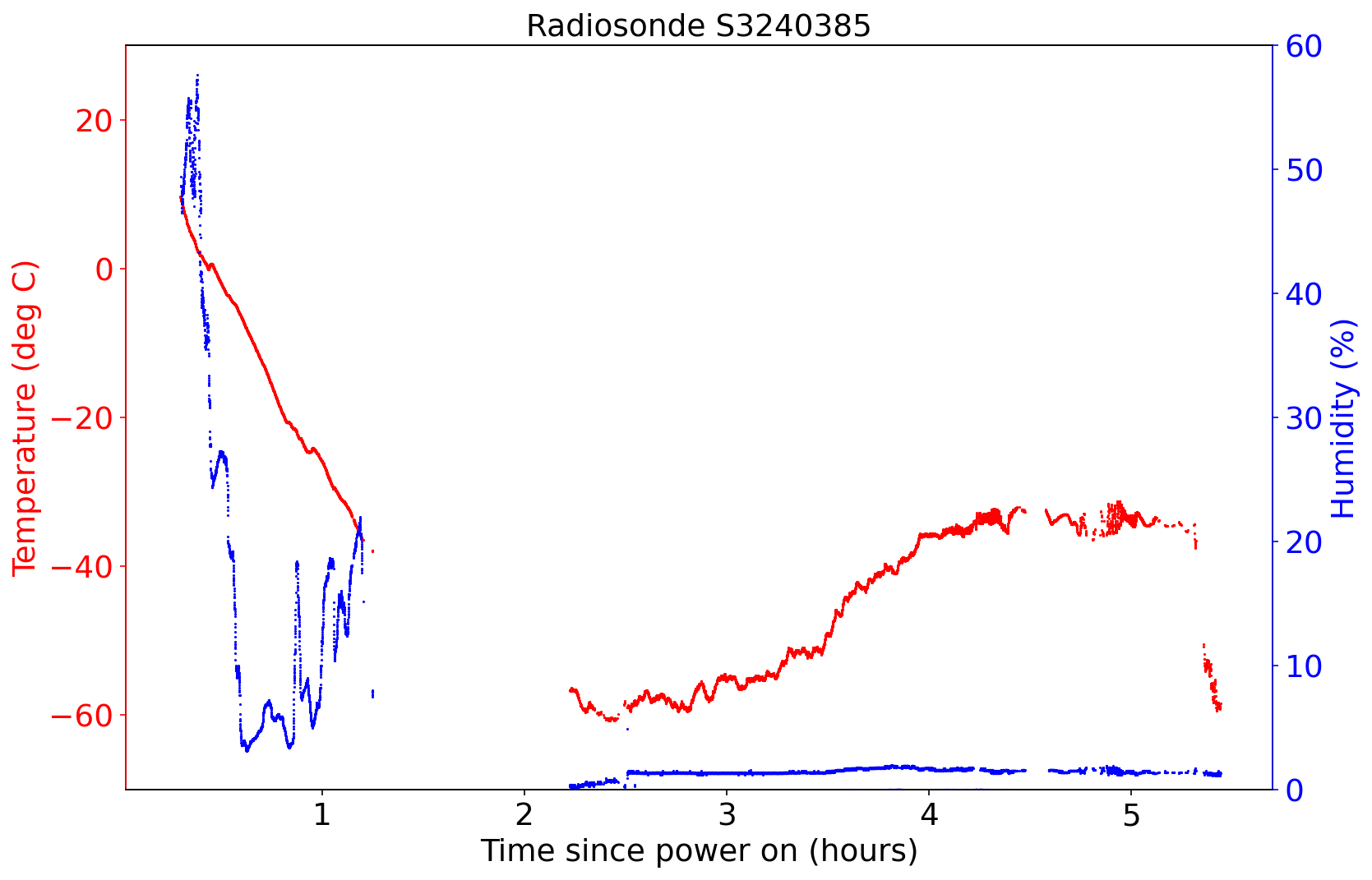
Unfortunately, since this launch was not at the usual 1100Z/2300Z time frame, I am unable to find the official calibrated skew-t plot from this flight. I think this was just a test flight to prove that the autolauncher works again, and the telemetry data was discarded.
Map
Here is a map of all the packets I received from my two stations.
Code
As with my previous post about the difference between my two receivers, to make the plots above I used an Ubuntu 20.04 Desktop virtual machine.
Jupyter notebook, using Jupyter 6.1.5, Python 3.8.5, Matplotlib 3.3.3, Pandas 1.1.5, and Geopandas 0.8.1.
Supplementary files, including the shapefiles and balloon telemetry.
Code, with the jupyter notebook comments:
#!/usr/bin/env python
# coding: utf-8

# In[1]:


# Reset variables
get_ipython().run_line_magic('reset', '')


# In[2]:


import pandas as pd
import matplotlib
import matplotlib.pyplot as plt
import descartes
import geopandas as gpd
import glob, os
import matplotlib as mpl
from shapely.geometry import Point, Polygon
from matplotlib.pyplot import figure


# In[3]:


# I received this floater balloon from both of my stations, one in San Francisco and
# the other station in Los Gatos. I need to merge these two datasets into one dataframe

# This log file was received in San Francisco station, radiosonde_auto_rx version 1.4.1
df1 = pd.read_csv('20210312-204802_S3240385_RS41_404201_sonde.log')

# This log file was received by the Los Gatos station, radiosonde_auto_rx version 1.3.2
df2 = pd.read_csv('20210312-224417_S3240385_RS41_404201_sonde.log')

# Concatenate the two dataframes. This just adds the second dataframe (Los Gatos data)
# on to the end of the first dataframe (San Francisco data)
df3 = pd.concat([df1, df2], ignore_index=True)

# Since a particular packet was sometimes received by both stations, discard the second
# instance of that packet. In other words, throw out the duplicate Los Gatos data. Use
# the "frame" column to check for duplicates.
df4 = df3.drop_duplicates(subset='frame', keep='first')

# The dataframe has the unique Los Gatos data on the end, so resort the list based on
# Frame number. This is not needed for computer use, just for humans readability.
df5 = df4.sort_values(by='frame')
print(df5)

# Save this new dataframe to CSV. Note that the Index number (first column) will be
# out of order, due to the sorting for human readability
csv_data = df5.to_csv('S3240385_merged.csv', index=True)


# In[4]:


# Just a quick sanity check to see all the Altitude data
plot = df5.plot(kind='scatter',x='frame',y='alt',color='red')

plot.set_title('S3240385 Altitude', fontsize=18)
plot.set_ylabel('Altitude (meters)', fontsize=14)
plot.set_xlabel('Frame num', fontsize=14)
plt.savefig('S3240385_altitude.jpg', bbox_inches='tight')


# In[5]:


# Insert another colum in the dataframe for "Hours since power on".
# Since we don't actually have the launch time, we will use the Frame
# number to approximate this. Frame number increments every second.

df5.insert(3, "hrs_since_poweron", (df5.frame/3600), True)

print(df5)


# In[6]:


# Plot the vertical velocity of the balloon. Balloons target 5 m/s ascent
# rate, so draw some horizontal lines at 5 m/s and 0 m/s (neutrally bouyant)
fig = plt.figure(figsize=(12,8), dpi=150)

ax = fig.add_subplot(111)
ax.set_ylim([-5,10])
ax.axhline(y=5, color='green', linestyle='dashed')
ax.axhline(y=0, color='green', linestyle=(0, (3, 10)))
df5.plot.scatter(x='hrs_since_poweron',y='vel_v',s=1,color='red',ax=ax)


# In[7]:


# Plot of horizontal velocity of balloon, with MPH also
fig = plt.figure(figsize=(12,8), dpi=150)
fig.patch.set_facecolor('white')

# Set up the axes
ax1 = fig.add_subplot(111)
ax2 = ax1.twinx()


ax1.scatter(x=df5['hrs_since_poweron'],y=df5['vel_h'], s=1, c='red', marker=".")
ax1.set_title('Radiosonde S3240385 Horizontal Velocity', fontsize=18)
ax1.set_ylabel('Horizontal velocity (m/s)', fontsize=18)
ax1.set_xlabel('Time since power on (hours)', fontsize=18)
ax1.tick_params(axis='both', which='major', labelsize=18)


# Add a second axis with MPH instead of m/s
vel_mph = lambda vel_h: vel_h*2.237

# get left axis limits
ymin, ymax = ax1.get_ylim()
# apply function and set transformed values to right axis limits
ax2.set_ylim((vel_mph(ymin),vel_mph(ymax)))
# set an invisible artist to twin axes
# to prevent falling back to initial values on rescale events
ax2.plot([],[])

ax2.set_ylabel('Horizontal velocity (mph)', fontsize=18)
ax2.tick_params(axis='y', which='major', labelsize=18)


# Save the final plot
fig.savefig('S3240385_vel_mph.png', bbox_inches='tight')


# In[8]:


# Plot of horizontal rate and balloon altitude on one graph
fig = plt.figure(figsize=(12,8), dpi=150)
fig.patch.set_facecolor('white')

# Functions to convert
vel_mph = lambda vel_h: vel_h*2.237
alt_feet = lambda alt: alt*3.281

# Set up the axes: Main axis ax1 has subplot ax2 (which is a twin axis)
ax1 = fig.add_subplot(111)
ax2 = ax1.twinx()
# ax3 is a secondary axis of ax1, with functions
ax3 = ax1.secondary_yaxis(-0.1, functions=(vel_mph, vel_mph))
# ax4 is a secondary axis of ax2, with functions
ax4 = ax2.secondary_yaxis(1.15, functions=(alt_feet, alt_feet))


# Plot horiz velocity scatterplot on ax1
ax1.scatter(x=df5['hrs_since_poweron'],y=df5['vel_h'], s=1, c='red', marker=".")
# Colors and labels for ax1
ax1.set_title('Radiosonde S3240385 Horizontal Velocity and Altitude', fontsize=18)
ax1.set_ylabel('Horizontal Velocity (m/s)', fontsize=18)
ax1.set_xlabel('Time since power on (hours)', fontsize=18)
ax1.yaxis.label.set_color('red')
ax1.tick_params(axis='y', colors='red')
ax1.tick_params(axis='both', which='major', labelsize=18)


# Plot altitude scatterplot on twin axis ax2
ax2.scatter(x=df5['hrs_since_poweron'],y=df5['alt'], s=1, c='blue', marker=".")
# Set colors and labels for twin axis ax2
ax2.set_ylabel('Balloon altitude (m)', fontsize=18)
ax2.spines['left'].set_color('red')
ax2.spines['right'].set_color('blue')
ax2.yaxis.label.set_color('blue')
ax2.tick_params(axis='y', colors='blue')
ax2.get_yaxis().set_major_formatter(matplotlib.ticker.StrMethodFormatter('{x:,.0f}'))
ax2.set_ylim([0,40000])
ax2.tick_params(axis='y', which='major', labelsize=18)


# ax3 is generated above as the Secondary Axis of ax1
# Colors and labels for 3rd axis
ax3.tick_params(axis='y', colors='red')
ax3.spines['left'].set_color('red')
ax3.yaxis.label.set_color('red')
ax3.set_ylabel('Horizontal Velocity (MPH)', fontsize=18)
ax3.tick_params(axis='y', which='major', labelsize=18)


# ax4 is generated above as the Secondary Axis of ax2
# Colors and labels for 4th axis
ax4.tick_params(axis='y', colors='blue')
ax4.spines['right'].set_color('blue')
ax4.yaxis.label.set_color('blue')
ax4.set_ylabel('Balloon Altitude (feet)', fontsize=18)
ax4.tick_params(axis='y', which='major', labelsize=18)
ax4.get_yaxis().set_major_formatter(matplotlib.ticker.StrMethodFormatter('{x:,.0f}'))


# Save the final plot
fig.savefig('S3240385_velocity_MPH_feet.png', bbox_inches='tight')


# In[9]:


# Plot of ascent rate and balloon altitude on one graph
fig = plt.figure(figsize=(12,8), dpi=150)
fig.patch.set_facecolor('white')

ax1 = fig.add_subplot(111)
ax2 = ax1.twinx()
ax1.scatter(x=df5['hrs_since_poweron'],y=df5['vel_v'], s=1, c='red', marker=".", label='velocity')
ax1.set_title('Radiosonde S3240385', fontsize=18)
ax1.set_ylabel('Ascent rate (m/s)', fontsize=18)
ax1.set_xlabel('Time since power on (hours)', fontsize=18)
ax1.yaxis.label.set_color('red')
ax1.tick_params(axis='y', colors='red')
ax1.axhline(y=5, color='green', linestyle='dashed')
ax1.axhline(y=0, color='green', linestyle=(0, (3, 10)))
ax1.set_ylim([-45,10])
ax1.tick_params(axis='both', which='major', labelsize=18)

ax2.scatter(x=df5['hrs_since_poweron'],y=df5['alt'], s=1, c='blue', marker=".", label='alt')
ax2.set_ylabel('Balloon altitude (m)', fontsize=18)
ax2.spines['left'].set_color('red')
ax2.spines['right'].set_color('blue')
ax2.yaxis.label.set_color('blue')
ax2.tick_params(axis='y', colors='blue')
ax2.get_yaxis().set_major_formatter(matplotlib.ticker.StrMethodFormatter('{x:,.0f}'))
ax2.set_ylim([0,40000])
ax2.tick_params(axis='y', which='major', labelsize=18)


# Save the final plot
fig.savefig('S3240385_ascent_altitude.png', bbox_inches='tight')


# In[10]:


# Zoom plot of ascent rate and balloon altitude on one graph
fig = plt.figure(figsize=(12,8), dpi=150)
fig.patch.set_facecolor('white')

ax1 = fig.add_subplot(111)
ax2 = ax1.twinx()
ax1.scatter(x=df5['hrs_since_poweron'],y=df5['vel_v'], s=1, c='red', marker=".", label='velocity')
ax1.set_title('Radiosonde S3240385', fontsize=18)
ax1.set_ylabel('Ascent rate (m/s)', fontsize=18)
ax1.set_xlabel('Time since power on (hours)', fontsize=18)
ax1.yaxis.label.set_color('red')
ax1.tick_params(axis='y', colors='red')
ax1.axhline(y=5, color='green', linestyle='dashed')
ax1.axhline(y=0, color='green', linestyle=(0, (3, 10)))
ax1.set_ylim([-2,6])
ax1.set_xlim([3.5,5.5])

ax1.tick_params(axis='both', which='major', labelsize=18)

ax2.scatter(x=df5['hrs_since_poweron'],y=df5['alt'], s=1, c='blue', marker=".", label='alt')
ax2.set_ylabel('Balloon altitude (m)', fontsize=18)
ax2.spines['left'].set_color('red')
ax2.spines['right'].set_color('blue')
ax2.yaxis.label.set_color('blue')
ax2.tick_params(axis='y', colors='blue')
ax2.get_yaxis().set_major_formatter(matplotlib.ticker.StrMethodFormatter('{x:,.0f}'))
ax2.set_ylim([20000,40000])
ax2.tick_params(axis='y', which='major', labelsize=18)

# Save the final plot
fig.savefig('S3240385_ascent_altitude_zoom.png', bbox_inches='tight')


# In[11]:


# Plot of temperature and humidity on one graph
fig = plt.figure(figsize=(12,8), dpi=150)
fig.patch.set_facecolor('white')

ax1 = fig.add_subplot(111)
ax2 = ax1.twinx()
ax1.scatter(x=df5['hrs_since_poweron'],y=df5['temp'], s=1, c='red', marker=".", label='velocity')
ax1.set_title('Radiosonde S3240385', fontsize=18)
ax1.set_ylabel('Temperature (deg C)', fontsize=18)
ax1.set_xlabel('Time since power on (hours)', fontsize=18)
ax1.yaxis.label.set_color('red')
ax1.tick_params(axis='y', colors='red')
ax1.set_ylim([-70,30])
ax1.tick_params(axis='both', which='major', labelsize=18)

ax2.scatter(x=df5['hrs_since_poweron'],y=df5['humidity'], s=1, c='blue', marker=".", label='alt')
ax2.set_ylabel('Humidity (%)', fontsize=18)
ax2.spines['left'].set_color('red')
ax2.spines['right'].set_color('blue')
ax2.yaxis.label.set_color('blue')
ax2.tick_params(axis='y', colors='blue')
ax2.get_yaxis().set_major_formatter(matplotlib.ticker.StrMethodFormatter('{x:,.0f}'))
ax2.set_ylim([0,60])
ax2.tick_params(axis='y', which='major', labelsize=18)


# Save the final plot
fig.savefig('S3240385_temp_humidity.png', bbox_inches='tight')


# In[12]:


# Now on to plotting the lat/long of the balloon on a map

# Generate a geometry list of all the lat/long points in the dataframe
geometry = [Point(xy) for xy in zip( df5["lon"], df5["lat"]) ]
geometry[:3]


# In[13]:


# Create a geopandas dataframe, using the pandas dataframe and the geometry points
geo_df = gpd.GeoDataFrame(df5,                 #specify data
                         crs = 'EPSG:4326',    #specify coordinate ref system
                         geometry = geometry)  #specify geometry list created

# Show a snippet of this dataframe
geo_df.head()


# In[14]:


# Create the basemap of the area. The original shapefile are census areas in California.
# Also need .shx and .prj files in the same folder
census_map = gpd.read_file('TG00CAZCTA.shp')

# The census map's shapefile is using UTM coordinates for all the points. This changes the
# Coordinate Reference System to WGS84 lat/lon, which is what the radiosonde telemetry is in
census_map = census_map.to_crs('EPSG:4326')

# Create a plot, set some lat/long limits, and plot it
fig,ax = plt.subplots(figsize = (15,15))
ax.set_ylim([36, 38.25])
ax.set_xlim([-123, -118])
census_map.plot(ax = ax, linewidth=1, edgecolor='black')


# In[15]:


# Set up some limits for the map
fig,ax = plt.subplots(figsize = (15,15))
fig.patch.set_facecolor('white')

ax.set_box_aspect(1)
ax.set_ylim([36, 38.25])
ax.set_xlim([-123, -119.75])
ax.set_ylabel('WGS84 Latitude', fontsize=14)
ax.set_xlabel('WGS84 Longitude', fontsize=14)
ax.set_title('S3240385 Floater', fontsize=18)
census_map.plot(ax = ax, alpha = 0.4, color="blue", linewidth=1, edgecolor='black')

# Now actually plot the geopandas dataframe.
geo_df.plot(ax = ax, markersize = 1, color = "red", marker = "o")

plt.savefig('S3240385_float.png', bbox_inches='tight')


# In[ ]: